Why the Helvetica font got a digital makeover


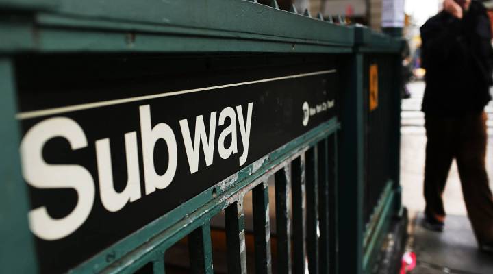
When it comes to the world of fonts, there are hundreds to play around with but few that stand on top. There are the classics like Times New Roman, Arial and Helvetica. Since its creation in 1957, Helvetica has been widely used as a branding font. American Airlines, American Apparel, the New York City subway system and even your federal tax forms all use the ubiquitous font.
But in recent years, digital companies like Apple, Google and Netflix have chosen to ignore Helvetica altogether and design their own Helvetica-inspired fonts. That’s why the company Monotype, which owns the rights to Helvetica, has redesigned and rebranded the font in the hopes that digital companies will fall in love with the new Helvetica Now, a font type designed to work well on digital screens.
Here’s a side-by-side comparison of Helvetica and Helvetica Now:

Arielle Pardes, associate editor for Wired, spoke to Kai Ryssdal about the business of fonts and why Helvetica got a digital makeover.
Click the audio player above to hear the interview.
Stories You Might Like


There’s a lot happening in the world. Through it all, Marketplace is here for you.
You rely on Marketplace to break down the world’s events and tell you how it affects you in a fact-based, approachable way. We rely on your financial support to keep making that possible.
Your donation today powers the independent journalism that you rely on. For just $5/month, you can help sustain Marketplace so we can keep reporting on the things that matter to you.


